
Table of Contents
- Shopify Inspiration 2016
- What makes these Shopify inspiration stores stand out?
- Shopify Inspiration - Article
- Shopify Inspiration - Bottle Cutting Inc.
- Shopify Inspiration - Chalkd
- Shopify Inspiration - Dodocase
- Shopify Inspiration - Eat Boutique
- Shopify Inspiration - Faucet Face
- Shopify Inspiration - Good As Gold
- Shopify Inspiration - Holstee
- Shopify Inspiration - I am an eskimo
- Shopify Inspiration - Jane Motorcycles
- Shopify Inspiration - Kutoa
- Shopify Inspiration - Lollapalooza
- Shopify Inspiration - Mammoth
- Shopify Inspiration - Norwegian Rain
- Shopify Inspiration - Opena
- Shopify Inspiration - Pure Fix Cycles
- Shopify Inspiration - Quad Lock
- Shopify Inspiration - Roden Gray
- Shopify Inspiration - Shore Projects
- Shopify Inspiration - Tattly
- Shopify Inspiration - Ugmonk
- Shopify Inspiration - Victoire
- Shopify Inspiration - Wrightwood Furniture
- Shopify Inspiration - XU Alumni Shop
- Shopify Inspiration - Yellow Bird Project
- Shopify Inspiration - Zoku
- Design Trends We're Seeing in 2016
- How to Apply These Ideas to Your Store
- FAQs
Shopify Inspiration 2016
Over 200,000 online stores use Shopify, from small craft shops to big brand names. Here's some Shopify inspiration showcasing an A – Z list of Shopify Stores for 2016.
When you're building or redesigning a Shopify store, it helps to see what's actually working in the wild. Not the sanitised portfolio shots or award-winning sites that cost six figures to build, but real stores selling real products to real customers.
The stores in this list represent different approaches to e-commerce design, from minimalist fashion boutiques to quirky gift shops. What they have in common is that they've thought carefully about how their design serves their business goals. Some prioritise large product photography, others focus on storytelling, and a few have nailed the balance between aesthetics and conversion.
As you browse through these examples, look beyond the surface design. Pay attention to how they structure their navigation, how much information they show on collection pages, how they handle product variants, and how they use imagery to communicate their brand. These decisions matter far more than whether you like their colour scheme.
What makes these Shopify inspiration stores stand out?
Before diving into the list, it's worth understanding what separates effective Shopify stores from mediocre ones. It's rarely about trendy design or flashy animations.
They know their audience
Every successful store on this list has a clear understanding of who they're selling to and what those customers value. A fashion boutique targeting design-conscious urbanites will prioritise large imagery and minimal text, whilst a technical product might need detailed specifications front and centre. There's no universal "best" approach, only what works for your specific customers.
Navigation is intuitive, not clever
You won't find complex mega menus or hidden navigation on most of these sites. The best stores make it dead simple to find products and complete checkout. If someone has to think about how to navigate your site, you've already lost them.
Mobile isn't an afterthought
Mobile commerce is growing rapidly, and the stores that succeed treat mobile as a first-class experience, not a desktop site crammed onto a smaller screen. This means larger touch targets, simplified navigation, and faster load times.
Product presentation matches the product type
Fashion stores lead with lifestyle photography. Technical products show multiple angles and details. Furniture stores include room settings. It sounds obvious, but many stores get this wrong by following design trends rather than serving their products effectively.
They understand conversion psychology
Look at how these stores build trust through customer reviews, clear shipping information, and professional photography. Notice how they create urgency without being manipulative, and how they reduce friction in the buying process. These aren't accidents.
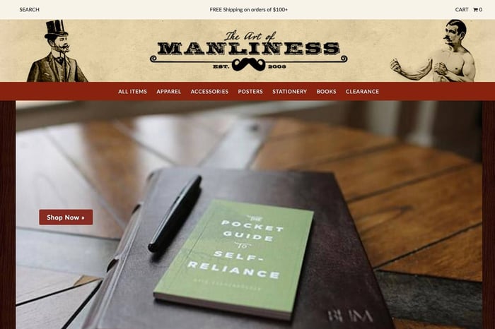
Shopify Inspiration - Article
High-end menswear boutique from Vancouver showcasing a carefully curated selection of premium brands. Their design uses generous whitespace and large product photography to create a gallery-like feel, which suits their positioning as a destination for discerning customers rather than bargain hunters. The minimal interface keeps focus on the clothing whilst the clean typography reinforces their premium positioning.
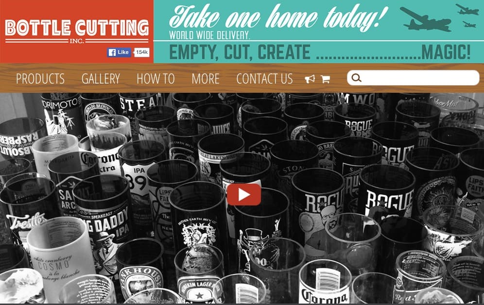
Shopify Inspiration - Bottle Cutting Inc.
Specialises in DIY bottle-cutting kits and supplies for upcycling glass bottles. The store balances educational content with product sales, using clear instructional imagery to demonstrate value. A good example of how even niche technical products can work well on Shopify.
Shopify Inspiration - Chalkd
New Zealand-based company creating handcrafted chalkboards for homes, cafes, and restaurants. Their store uses clean product photography and simple navigation to showcase their various chalkboard designs, from minimalist rectangles to shaped boards like hearts and speech bubbles. The site demonstrates how straightforward product presentation works well for physical craft products where the designs speak for themselves.

Shopify Inspiration - Dodocase
Creates handmade cases for tablets and phones using traditional bookbinding techniques. Their store blends product photography with storytelling about their craft process, helping justify premium pricing through an emphasis on quality and craftsmanship.
Shopify Inspiration - Eat Boutique
Online marketplace connecting customers with artisan food producers. Their grid-based layout makes browsing easy, with appetising product photography doing the heavy lifting. Shows how Shopify can work beyond traditional retail.
Shopify Inspiration - Faucet Face
Eco-friendly glass water bottle company that advocates for tap water over bottled water. Their store uses clean product photography and straightforward presentation to showcase their classic designs, custom bottles, and limited editions. The site demonstrates how mission-driven products can work on Shopify, with their donation programme to clean water charities integrated into the buying experience.
Shopify Inspiration - Good As Gold
Auckland fashion boutique mixing local and international streetwear brands. Their layout prioritises quick browsing with grid views and minimal chrome getting in the way. The design feels current without chasing trends, which is appropriate for a store selling fashion-forward products.
Shopify Inspiration - Holstee
Sells art prints, jewellery, and lifestyle products with a focus on mindful living. Their store combines commerce with content, using their manifesto and brand story to create emotional connection before pushing products. It's an approach that works when you're selling aspirational lifestyle products rather than commodities.
Shopify Inspiration - I am an eskimo
Melbourne-based boutique selling jewellery, homewares, and accessories with a distinctly Australian aesthetic. The simple navigation and large product imagery let the unique products speak for themselves. Their collection pages strike a good balance between showing enough products to browse whilst keeping individual items visible and clickable.
 Shopify Inspiration - Jane Motorcycles
Custom motorcycle shop and boutique selling gear, accessories, and apparel. Their design perfectly matches their brand identity, with gritty photography and bold typography that appeals to their target audience. It's a reminder that your store design should reflect your brand personality, not just follow generic e-commerce conventions.
 Shopify Inspiration - Kutoa
Social enterprise creating healthy, nutrient-dense snack bars with a mission to feed children in need. For every bar purchased, they donate meals to malnourished children globally and locally. Their store balances mission-driven storytelling with clear product presentation, showing how purpose-driven brands can integrate their social impact into the shopping experience without overwhelming the core buying journey.
 Shopify Inspiration - Lollapalooza
Festival merchandise store showing that even event-based retail can work effectively on Shopify. They use bold graphics and simple navigation to let fans quickly find and purchase merchandise. The store needs to handle traffic spikes during festival season, and Shopify's infrastructure manages this without requiring custom development.
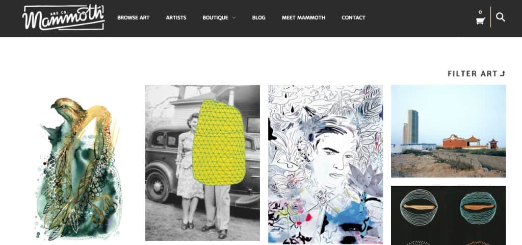
 Shopify Inspiration - Mammoth
Australian art and design store curating art prints and design objects with a focus on quality and aesthetic. Their photography style is consistent across all products, creating a cohesive brand experience. The store demonstrates how curation and presentation can differentiate you in a crowded market, particularly for art and design-focused retailers.
 Shopify Inspiration - Norwegian Rain
Premium raincoat brand from Norway emphasising Scandinavian design and functionality. Their store uses large hero imagery and minimal text to communicate quality and craftsmanship. The sparse product range is presented with confidence, showing that you don't need hundreds of products to build a successful online store.
Shopify Inspiration - Opena
Sells iPhone cases with an integrated bottle opener, solving a very specific problem for a very specific audience. Their store is straightforward and conversion-focused, getting people from landing page to checkout quickly. When you have a simple product solving a clear problem, your store design can be equally direct.
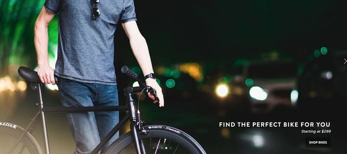
 Shopify Inspiration - Pure Fix Cycles
Sells fixed-gear and single-speed bikes with a focus on customisation and urban cycling. Their bike builder tool lets customers configure their ideal bike, demonstrating how Shopify can handle more complex product configurations. The vibrant imagery and energetic design appeal to their younger, urban target market.
 Shopify Inspiration - Quad Lock
Australian brand selling phone mounts for bikes and motorcycles. Their store emphasises product versatility through lifestyle photography showing the mounts in action. Clear product information and compatibility details help customers feel confident in their purchase, which is critical for technical accessories where fit matters.
 Shopify Inspiration - Roden Gray
Vancouver menswear boutique known for carrying cutting-edge Japanese and European brands. Their store design is understated, letting the unique products take centre stage. The editorial-style photography and generous spacing create a premium feel that matches their product selection and price points.
 Shopify Inspiration - Shore Projects
Watch brand from Australia selling affordable, design-focused timepieces. Their store uses large product imagery with minimal distractions, making it easy to browse their range. The clean, modern aesthetic of their site reflects the clean, modern aesthetic of their watches, creating brand consistency.
 Shopify Inspiration - Tattly
Sells designer temporary tattoos created by professional artists. Their store is playful and colourful, matching the product offering perfectly. The site makes it easy to browse by artist or design type, and the product photography clearly shows the tattoos in use, helping customers visualise how they'll look.
 Shopify Inspiration - Ugmonk
Clothing and lifestyle brand focused on minimalist design and quality basics. Their store is ruthlessly simple, with clean typography and product-focused photography. It's an excellent example of how restraint in design can actually make your products more appealing, especially when selling minimalist goods.
 Shopify Inspiration - Victoire
Canadian fashion boutique based in Ottawa with locations in both Ottawa and Toronto, curating independent Canadian designers and ethical fashion. Their store design is elegant and refined, with an emphasis on editorial-style photography and clean layouts. The site demonstrates how multi-location boutiques can create a cohesive brand experience online while showcasing local design talent.
 Shopify Inspiration - Wrightwood Furniture
Chicago furniture maker selling handcrafted pieces using reclaimed and sustainable materials. Their store uses room-setting photography to help customers visualise the furniture in context, which is essential for high-value furniture sales. The emphasis on craftsmanship and sustainability is clear from the homepage onwards.
 Shopify Inspiration - XU Alumni Shop
Xavier University merchandise store showing how educational institutions can effectively sell branded merchandise online. The straightforward categorisation and clear product imagery make it easy for alumni and students to find what they need. Sometimes simple and functional is exactly what's required.
 Shopify Inspiration - Yellow Bird Project
Sells t-shirts designed by indie musicians, with proceeds supporting music education charities. Their store effectively communicates their charitable mission whilst making it easy to shop by artist or cause. It's a good example of how purpose-driven commerce can work on Shopify without requiring custom development.
 Shopify Inspiration - Zoku
Sells innovative kitchen tools and drinkware, with their signature product being a quick-pop maker for frozen treats. Their store uses lifestyle imagery and clear product demonstrations to communicate value. The clean, modern aesthetic appeals to their design-conscious target market whilst keeping the focus on product functionality.
 Design Trends We're Seeing in 2016
Looking across these successful Shopify stores, several design patterns emerge that are defining e-commerce in 2016.
| Design Trend | What We're Seeing | Why It Works |
|---|---|---|
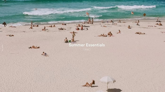
| Large Hero Images | Full-width hero images featuring lifestyle photography rather than plain product shots | Immediately communicates brand personality and helps visitors understand the store before browsing. Accelerating as internet speeds improve and high-resolution displays become standard. |
| Minimalist Layouts | Generous whitespace giving content room to breathe | Improves conversion by reducing cognitive load and making the path to purchase clearer. Not just aesthetic—it's functional. |
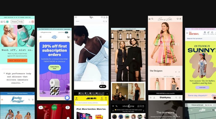
| Grid-Based Products | Grid layouts showing 2-4 products per row on desktop, scaling to 1-2 on mobile | Lets customers scan multiple products quickly. Works particularly well on mobile where vertical scrolling is natural. |
| Bold Typography | Oversized headings with generous line spacing | Responds to how people actually scan online rather than reading every word. Ensures readability on mobile devices. |
| Hamburger Menus | Three-line icon hiding mobile navigation | Frees up screen real estate for content and products. Now the de facto standard for mobile e-commerce. |
| Instagram Integration | Instagram feeds on homepage or Instagram-style imagery | Reflects growing importance of social commerce. Provides fresh, regularly-updated content without constant website updates. |
| Monochromatic Schemes | Restrained palettes using black, white, and 1-2 accent colours | Creates sophisticated, timeless feel. Ensures product imagery stands out, particularly in fashion and lifestyle stores. |
| Sticky Navigation | Headers that remain at top as you scroll with 5-7 main categories maximum | Keeps navigation accessible throughout browsing. Simple dropdowns preferred over mega menus. |
How to Apply These Ideas to Your Store
Looking at successful stores is useful, but only if you can translate what you see into actionable changes for your own site. Here's how to think about applying these ideas.
Start with your customers, not the design
Before you redesign your store to look like your favourite example from this list, ask whether that design actually serves your customers. A minimalist layout might work brilliantly for a fashion boutique but terribly for a hardware store where customers need detailed specifications. The best design for your store is the one that makes it easiest for your specific customers to find and buy your products.
Invest in product photography
Nearly every successful store in this list has professional-quality product photography. This is where you should spend money before you spend it on custom development or fancy features. For most products, you need at least three angles: front, back, and detail. For fashion, you need on-model shots. For furniture, you need room settings. If you can't afford a professional photographer, at least invest in proper lighting and learn basic photo editing.
Simplify your navigation
If you have more than seven main categories in your navigation, you probably need to consolidate. Most customers won't explore complex category structures—they'll use search or give up. Look at how the stores in this list organise their products and notice how simple their navigation is.
Make mobile your priority
Don't treat mobile as something to fix after you've perfected the desktop experience. More than half your traffic is probably mobile already, and that percentage is only increasing. Test your store on your actual phone, not just in desktop browser's device emulator. Is the text readable? Are the buttons easy to tap? Can you complete checkout without frustration?
Test your assumptions
Just because a design pattern works for Ugmonk doesn't mean it'll work for you. If you're considering a significant change to your store, test it first. You can use Shopify's built-in A/B testing through apps like Google Optimize, or simply launch the change and watch your conversion rate carefully for a few weeks.
Focus on the fundamentals first
Before you worry about Instagram integration or fancy hover effects, make sure your basics are solid: clear product titles, accurate inventory information, transparent shipping costs, easy checkout, and fast load times. These fundamentals matter more than any design trend.
Consider your product catalogue size
Stores selling 20 products can use different design patterns than stores selling 2,000 products. If you have a small catalogue, you can afford to give each product more space and emphasis. If you have a large catalogue, you need robust filtering and search to help customers find what they need.
Don't copy, adapt
The point of looking at these examples isn't to copy them exactly, but to understand the principles behind their design decisions and adapt those principles to your own situation. Your store should feel authentic to your brand, not like a clone of someone else's success.
The stores in this list succeed because they've thought carefully about their customers' needs and built their design around those needs. Some use minimalist layouts, others are more maximalist. Some prioritise imagery, others emphasise detailed information. There's no single formula for e-commerce success.
What they all have in common is clarity. They make it easy to understand what they sell, who it's for, and how to buy it. That's what you should aim for in your own store, regardless of which aesthetic approach you choose.
If you're working on a Shopify store and want help thinking through your design strategy, we work with e-commerce businesses across Australia to build stores that actually convert. Get in touch to discuss your project.
Hire a Shopify Developer

$1,600.00
Our pre-purchased blocks of time give you priority access to our senior (8+ years of experience) in-house Shopify developers for development, strategy, and VIP support. Available Package: 10 Hours - Ideal for medium-sized development projects What's Included: ✓ Dedicated account…
FAQs
What design elements should I focus on for my Shopify store?
Start with product photography—it's more important than any other design element. After that, focus on clear navigation, readable typography, and a simple checkout process. These fundamentals will improve your conversion rate more than any trendy design feature.
How can I make my product photography as effective as these stores?
You don't necessarily need expensive equipment, but you do need proper lighting and a clean background. Natural light from a window often works better than cheap artificial lighting. Take multiple angles of each product, including detail shots. For fashion, invest in on-model photography—products look completely different on a person than on a hanger. If hiring a professional is out of budget, spend time learning basic photography and photo editing rather than accepting mediocre photos.
What are common mistakes to avoid when designing a Shopify store?
The biggest mistake is prioritising aesthetics over usability. A beautiful store that's difficult to navigate or slow to load will convert poorly. Other common mistakes include cluttered navigation with too many categories, product images that are too small, unclear shipping information, complicated checkout processes, and poor mobile experiences. Also, avoid using too many different fonts or a cluttered colour scheme—restraint usually works better.
Should my Shopify store look like these examples?
Not necessarily. These stores work because their design matches their products and target audience. A hardware store shouldn't look like a fashion boutique. Focus on understanding why these stores make specific design decisions, then apply those principles to your own context rather than copying the aesthetics directly.
How important is mobile optimisation for my Shopify store?
Critical. Mobile commerce is growing rapidly, and if your store doesn't work well on phones, you're losing sales. All Shopify themes are responsive by default, but you should still test your store thoroughly on actual mobile devices. Pay attention to text size, button sizes, image loading speed, and the checkout process on mobile.
Do I need a custom Shopify theme or can I use a pre-built theme?
Most stores can work perfectly well with a pre-built theme, possibly with some customisation. The stores in this list include both custom builds and modified themes. Unless you have very specific requirements that can't be met with existing themes, start with a theme and customise it as needed. It's faster, cheaper, and usually more stable.
How many products should I show on collection pages?
Most successful stores show 12-24 products per page with pagination or infinite scroll. Showing too few products means more clicking to browse; showing too many hurts page load speed and can be overwhelming. The optimal number depends on your products—high-value items with important imagery might warrant fewer products per page, whilst lower-value impulse purchases can handle denser layouts.
Should I use a slideshow on my homepage?
Be cautious with slideshows. Many of the stores in this list use a single hero image rather than a carousel, because most visitors never click past the first slide. If you do use a slideshow, keep it to 3-4 slides maximum, ensure it works well on mobile, and make sure the most important message is in the first slide.
How do I choose colours for my Shopify store?
Start with your logo and brand colours if you have them. If not, look at successful stores in your industry and notice the colour patterns. Fashion and lifestyle stores often use monochromatic schemes with one or two accent colours. Technical or industrial products might use bolder colour combinations. Whatever you choose, use colours consistently and sparingly—your product photography should provide most of the colour in your store.
What's more important: homepage design or product pages?
Product pages are more important for conversion. Many visitors arrive at product pages directly from Google or social media, bypassing your homepage entirely. Make sure your product pages include multiple high-quality images, clear descriptions, pricing, shipping information, and prominent add-to-cart buttons. Your homepage is important for brand communication, but your product pages are where sales happen.